Collingwoodbuildinglover
Senior Member
I actually really really like that
I actually really really like that
these grand wavy titanium panels are made to be viewed from a distance on a postcard, not up close.
This is certainly understated for Gehry, but in this case, that is a good thing. The towers are wonderfully sculptural, and this restrained(for Gehry)street-level treatment allows them to shine. IMO, the worst thing we could end up with at street-level would be something akin to his treatment of the AGO's Dundas St. facade, his first Toronto commission, which I've always found monotonous and forced(granted, the pre-existing brutalist structure somewhat constrained him, but that's still no excuse).
In just about any other instance, I'd argue for keeping the old structures, but these towers will be a game-changer for Toronto. For the 96-year-old Gehry, they may very well be his last Toronto project. In much the same way that the CN Tower did fifty years ago, these towers could help define Toronto's skyline for generations to come and, in doing so, will (hopefully) raise the standard for subsequent highrises. As such, I believe they deserve a blank canvas.Love the design of the base. But still wish they retained the brick buildings that stood where these are going up. At at least in part. If they removed the paint and restored the original brick it would’ve brought so much charm to the area
Agreed in full. It's something that still bothers me about this project. Duncan street is one of the rare examples of mostly well kept, formerly industrial/warehouse stock left in the ED, and while a token facadism may have been awkward for this project, I think it would've been better to respect the site's history.Love the design of the base. But still wish they retained the brick buildings that stood where these are going up. At at least in part. If they removed the paint and restored the original brick it would’ve brought so much charm to the area
Yeah...that doesn't appear to have those subtle curves at ground level that was indicated in the model. Likely adding to the cries that this is too generic, lack of being engaging and even fairly conservative for who is behind this design wise.Heeeeere we have it!
View attachment 640346
Love the design of the base. But still wish they retained the brick buildings that stood where these are going up. At at least in part. If they removed the paint and restored the original brick it would’ve brought so much charm to the area
In just about any other instance, I'd argue for keeping the old structures, but these towers will be a game-changer for Toronto. For the 96-year-old Gehry, they may very well be his last Toronto project. In much the same way that the CN Tower did fifty years ago, these towers could help define Toronto's skyline for generations to come and, in doing so, will (hopefully) raise the standard for subsequent highrises. As such, I believe they deserve a blank canvas.
This is certainly understated for Gehry, but in this case, that is a good thing. The towers are wonderfully sculptural, and this restrained(for Gehry)street-level treatment allows them to shine. IMO, the worst thing we could end up with at street-level would be something akin to his treatment of the AGO's Dundas St. facade, his first Toronto commission, which I've always found monotonous and forced(granted, the pre-existing brutalist structure somewhat constrained him, but that's still no excuse).
I also noticed you updated this project's title on its Wikipedia page and uploaded your above photo to that page today.
The chief Design Architect for the latest AGO extension is New York-based Selldorf Architects, with Diamond Schmidt mostly acting as Architect of Record, so if you're not liking the Dani Reiss Modern and Contemporary Gallery Extension, then it's Selldorf's design you should be unhappy with.The last best chance was if the AGO had gone back to Gehry to build an offsite AGO for the new modern art gallery instead of their upcoming extension. I still can't believe they went to Diamond & Schmitt for that.
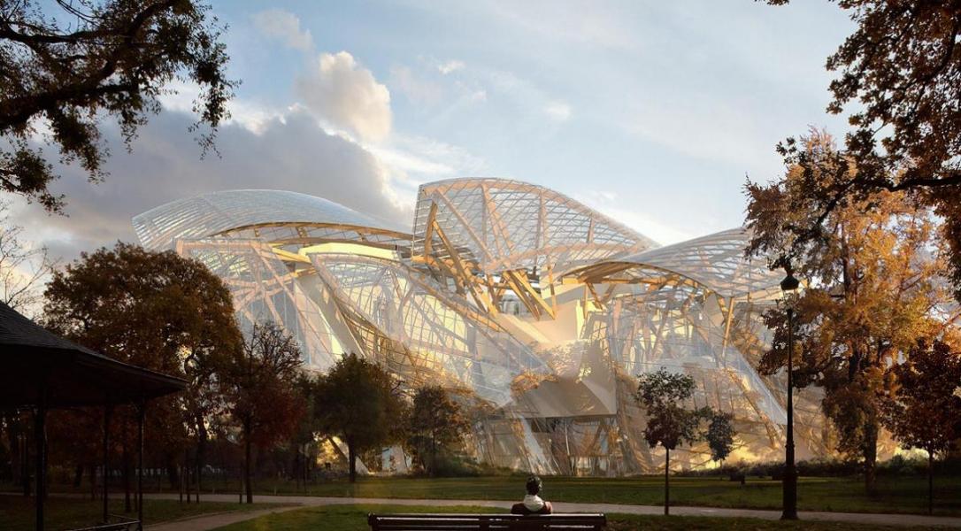
You'd like a building designed specifically for Paris, sited in one of their most important public spaces, designed with close input from all levels of government and only made possible at unknown expense (it didn't cost $135M) by a multinational luxury-goods Moloch, to get shoehorned behind some shitty condos beneath a flightpath to a regional airport?I'm with @Doppleganger on this. These towers deserve a blank canvas. King Street needs more open lobbies as you approach University and the financial core. The brick building would've been too opaque — literal brick walls. You may be romanticizing the brick building with rose coloured glasses. This was not particularly worth keeping and came with accessibility challenges that would've resulted in a completely different brick building had they had to bring it down to ground level.
The AGO is a cautionary tale supporting the above argument. Gehry didn't have a blank canvas there and had to compromise. Nonetheless, I think you're discounting Galleria Italia which is a wonderful space, both inside and outside. The misfortune is that it seems to have been created in Gehry's LA studio rather than living in the space. Dundas is a bit too narrow to appreciate it from across the street. It probably worked well in isolation viewed on a 3D model from the sky. The solution is that the block of old townhouses would make a beautiful park, a Grange Park North if the city had the ambition to bring more park space to a part of the city that desperately needs it.
I would still like a "real Gehry" in Toronto, a Fondation Louis Vuitton in the Portlands perhaps, but reality sets in: Mr. Gehry is sadly out of time.
The last best chance was if the AGO had gone back to Gehry to build an offsite AGO for the new modern art gallery instead of their upcoming extension. I still can't believe they went to Diamond & Schmitt for that.
Full disclosure, there are nice parts to the Guggenheim along the river where the stone facades are, but these grand wavy titanium panels are made to be viewed from a distance on a postcard, not up close.