

News   GLOBAL  |  Apr 02, 2020
 11K     0 
News   GLOBAL  |  Apr 01, 2020
 43K     0 
News   GLOBAL  |  Apr 01, 2020
 6.9K     0 
I disagree with the idea that TTC had the perfect standard and Metrolinx should follow it. The Metrolinx standard allows for the TTC Subway Font and also has white text on black background so the transition to a GTA standard need not be painful. The TTC itself didn't add the line 1-3 markers until more recent times, and what benefit is there to keeping H4 and CLRT symbols to represent subways and streetcars. A standard is required that isn't the mess that exists now at key locations like Kipling.
 
...
2. The sign is completely ambigous. Is this a wheelchair accessible entrance to the Ontario Science Centre? Is this the bus-only entrance to the Science Centre station? Who knows.
3. The tram symbol is meaningless to users. The symbol looks almost indistinugable to a bus. Users don't know or care whether their vehicle has a pantograph, and they should not have to be concerned with these technical details. Also, the pantograph will be completely illegible to users with low vision. Put the Line 5 symbol on it.
...
2. Once ALL entrances are wheelchair accessible, only then should they get rid of the symbol. If even one entrance is not accessible, keep the symbol.
3. The tram symbol is already meaningful to most users. There maybe some users who need to be assigned some homework on symbol recognition, but most will be able to figure it out. Maybe some tweaking.
 
Were complaining so it’s working
My point is that it's not comprehensive, or representative.

Anyways, I'm just curious as to what the methodology is. It sounds like it's "put something out there and wait for Twitter and enthusiast feedback". If so, that's an interesting way to solicit for opinions on transit signage.
 
Needs a big red and white winged TTC logo on it, just like every other higher order transit station in Toronto.

I am not a fan of either obsessive design and wayfinding debate (which is endless with no one ever reaching agreement) or the obsessive ML branding wonkery (which will spend our money debating and redrawing said minutae til the cows come home).

So long as it has the traditional TTC logo on it, native Torontonians will get the idea, and visitors will figure out same within a couple trips. I do like the traditional TTC station exterior font, but really - it can be Courier as long as it’s large and well lit.

The curiosity I have... at the top of the stairs/escalator, what will it say? The traditional TO TRAINS ? Or just a Tram logo?

- Paul
 
I am not a fan of either obsessive design and wayfinding debate (which is endless with no one ever reaching agreement) or the obsessive ML branding wonkery (which will spend our money debating and redrawing said minutae til the cows come home).

So long as it has the traditional TTC logo on it, native Torontonians will get the idea, and visitors will figure out same within a couple trips. I do like the traditional TTC station exterior font, but really - it can be Courier as long as it’s large and well lit.

The curiosity I have... at the top of the stairs/escalator, what will it say? The traditional TO TRAINS ? Or just a Tram logo?

- Paul
I agree. IMO as long as it has the TTC logo and the Line 5 symbol, I'm happy. I don't understand the reasoning for leaving out the Line 5 symbol at the entrance though. The symbol is certainly there within the station.

1622581268704.png


1622581307690.png


But why not out here as well?

1622581425617.png


1622581452011.png
 
And I think the funniest part about all this is that Metrolinx couldn't be bothered to paint the LRVs a different color because they wanted the LRVs to have a similar feeling to the subway trains on the TTC while they create a brand new standard for signage almost fully independent of the TTCs. Come on Metrolinx.
 
And I think the funniest part about all this is that Metrolinx couldn't be bothered to paint the LRVs a different color because they wanted the LRVs to have a similar feeling to the subway trains on the TTC while they create a brand new standard for signage almost fully independent of the TTCs. Come on Metrolinx.
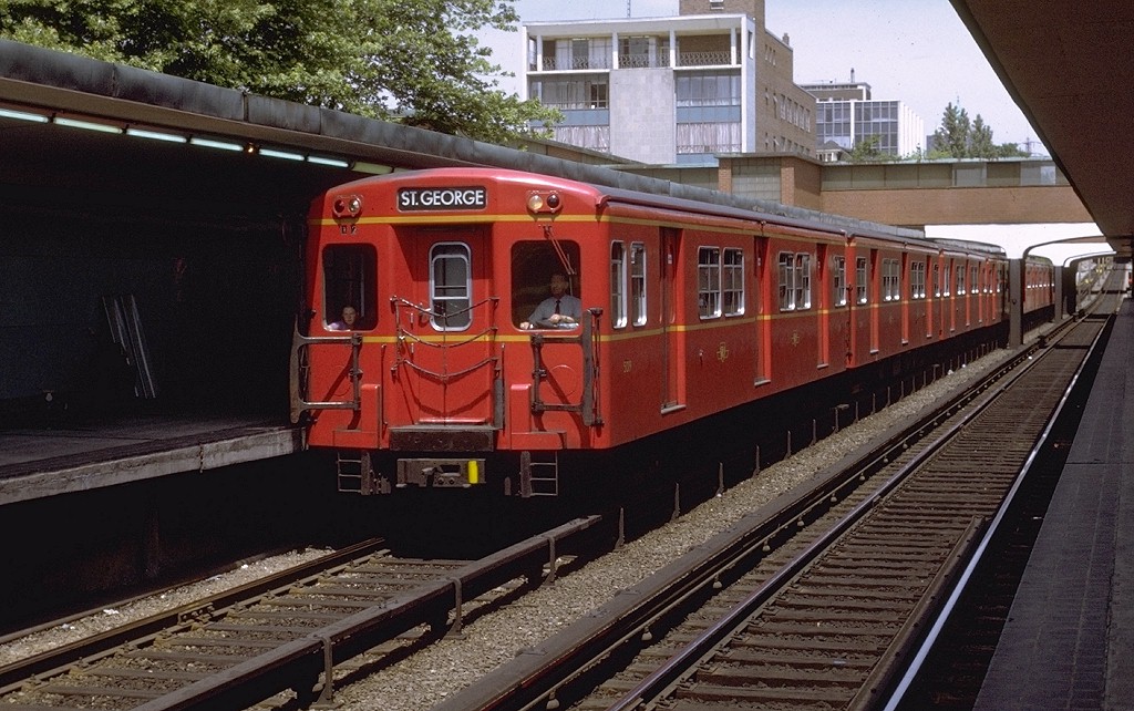
The TTC subway trains do not look grey to me...
The_Red_Rocket_%281%29.jpg

From link.
 
Also Steve Munro decided to ask Mx where the grass is, in the ROW.

This was the answer he was given:

1622639404461.png

from: https://stevemunro.ca/2021/06/01/where-is-the-grass/

*****

Sedum and Grass perform rather differently.

I don't understand why a decision hasn't been made yet, for what would be a very large order.

If they want to test performance of Sedum and/or different grasses in the ROW, test patches should be being installed now. (but last year would have been better); because you want to see how the stuff holds up
to both summer drought, and winter (frost, ice build up, salt, and spring melt conditions)
 
Also Steve Munro decided to ask Mx where the grass is, in the ROW.

This was the answer he was given:

View attachment 324516
from: https://stevemunro.ca/2021/06/01/where-is-the-grass/

*****

Sedum and Grass perform rather differently.

I don't understand why a decision hasn't been made yet, for what would be a very large order.

If they want to test performance of Sedum and/or different grasses in the ROW, test patches should be being installed now. (but last year would have been better); because you want to see how the stuff holds up
to both summer drought, and winter (frost, ice build up, salt, and spring melt conditions)
This is good to hear - sedum also looks very nice, this photo is from Le Mans, France.

unnamed.jpg
 
This is good to hear - sedum also looks very nice, this photo is from Le Mans, France.

View attachment 324550

It can; there are different kinds of sedum, of course!

Its been used here for the Green Roof on Victoria Park Station.

But that will have a different materials under it than in the ROW; and the roof won't be subject to any issues w/salt either.

I'm scratching my head to think if I've seen used at road level much in the GTA.

Here's VP Station:

1622653328166.png

Taken from: https://transittoronto.ca/photos/su...-park-station/victoria-park-station-1300.html
 

Back
Top