Northern Light
Superstar
Source? This cannot be
Tis indeed so.
Here's your source:
https://www.toronto.ca/city-governm...714951&pid=230304&title=259-LAKE-SHORE-BLVD-E
Look in the Planning Rationale for most of the renders.
Source? This cannot be
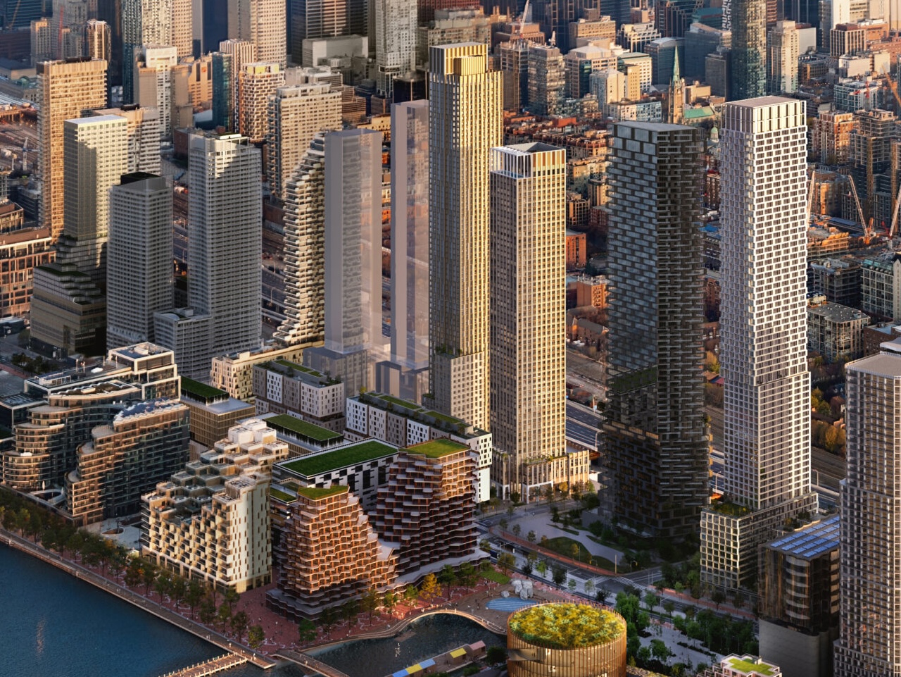
Thanks for sharing, this is horrific news so is it safe to assume all the proposed condos in this area will be completely overhauled? City of Toronto has no regard to livability, what a shame I was looking forward to what was to come.Tis indeed so.
Here's your source:
https://www.toronto.ca/city-governm...714951&pid=230304&title=259-LAKE-SHORE-BLVD-E
Look in the Planning Rationale for most of the renders.
Thanks for sharing
this is horrific news
so is it safe to assume all the proposed condos in this area will be completely overhauled?
City of Toronto has no regard to livability, what a shame I was looking forward to what was to come.
Yes, building 2 is staying fairly close to what was planned; but Building 1A, which is now 1A1 and 1A2 is a complete re-design, and not for the better.
Other buildings we don't necessarily have new renders for just yet.
Buildings 1A1/1A2 are a Rezoning, not a building design (and there are no renderings) so I think it's premature to comment.
1B (Henning Larsen) looks great, very similar to previous design in a lot of ways.
No comment about the rest of it. -__-
I stand to be corrected.The street level experience still looks pretty good.
Is the QQE rebuild still contingent on the “lrt” moving forward?
Oh good, more grey. Just what this city needs!
The street level rendering with the "Slow Brew" makes it look pretty grey (also the park space is very grey outside of the plants). But yeah in retrospect overall it's more Greige than Grey. Still, not exactly an exciting colour pallet.I don't like the new design either but I need to ask you which renderings you are looking at because almost none of the depicted building is grey.
Fun fact: if the previous building had exposed timber at its exterior as depicted (though not sure how that would ever be achieved from a practical POV), it would have turned grey within a couple years of completion... greyer than this new design in fact.
The street level rendering with the "Slow Brew" makes it look pretty grey. But yeah in retrospect overall it's more Greige than Grey. Still, not exactly an exciting colour pallet.

