Being inexpensive does not need to equal being bad.

While I agree, Snyder seems to win most of the TDSB work and is quite consistent in producing dreck.

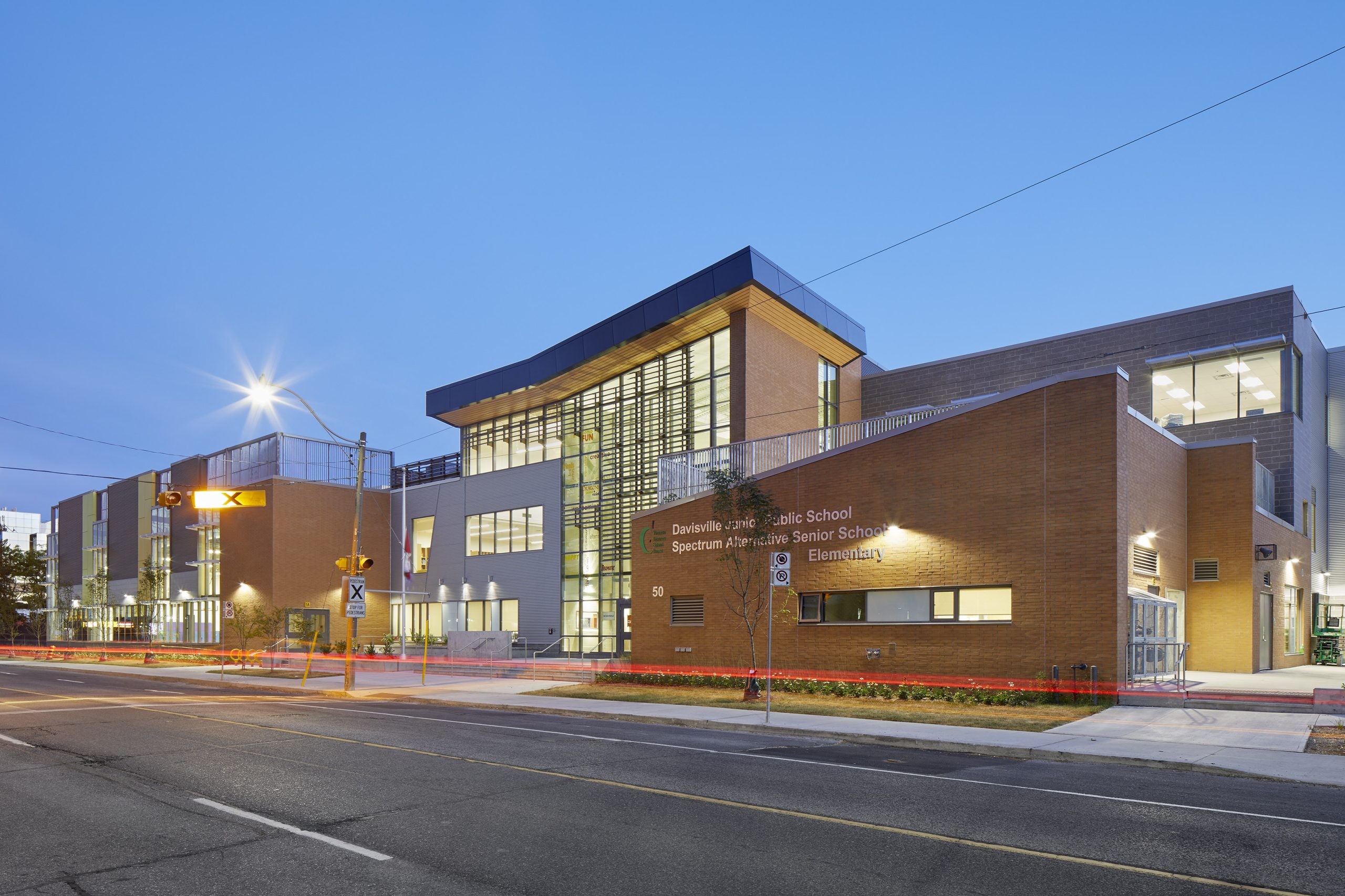
With this design the TDSB has been expensive and ugly.

The final budget here was ~42M For a High School that's quite cheap.

I would expect to see it be twice that costly. (were it well done)
 
While I agree, Snyder seems to win most of the TDSB work and is quite consistent in producing dreck.


The final budget here was ~42M For a High School that's quite cheap.

I would expect to see it be twice that costly. (were it well done)
I'm sure there's a design cost efficiency in having an architecture firm already familiar with TDSB standards, which helps them to win contracts.

But I agree wholeheartedly that greater variety/competition in architecture could produce better design, new ways of doing things and better outcomes for the board.

I agree that is a low budget and is driven by a cash strapped board. Spending 42 million and getting a bland or neutral building because of cost is something I can wrap my head around. But to spend that same money to produce something plain ugly (imo), which I doubt the longevity of, just hurts more.
 
Simple masonry with rationalized glazing/windows and the marque cantilever design statement would have made for legible, if understated, design that was visually pleasing or neutral, rather than the ad hoc fever dream the TDSB decided on.

I don't necessarily fault the architects for their design, but I can't imagine this was their ultimate vision.

Some samples of the architects’ work:

IMG_5326.jpeg
IMG_5325.jpeg
IMG_5324.jpeg
 
Don't forget about this beaut, Alex!!

View attachment 643978

In this era of cleavage with the US, should we in fact be proud of the distinct Canadian institutional urge to choose architecture that says "don't take this institution seriously"? /s
 
That Snyder certainly has a thing for that beige brick. It puts the institute in the institution... >.<
 
When I was walking by I noticed that it just feels very incoherent. As you can see in the first photo, because it's a jumble of a bunch of pieces you can't sense of the building as a whole. It's a non-building building. A building that form forgot.
 
When I was walking by I noticed that it just feels very incoherent. As you can see in the first photo, because it's a jumble of a bunch of pieces you can't sense of the building as a whole. It's a non-building building. A building that form forgot.

Welcome to Toronto. :)

They should've kept the original.
 
Some pix of the main space on the main floor that I assume is going to be a great community space/asset for Bloordale. Finally an image of the colours around the entrance as I find it amusing how 5m2 of pastel blue can spark deep outrage among some members! 🤭Taken 31 May.

View attachment 655231
View attachment 655232
This literally looks inspired by the inside of a prison common area...what on earth is this non-sense.
 

Back
Top