TransitBart
Senior Member
I hope this government gets rid of the terrible 'three men in a bathtub trillium' logo that the Liberals felt free to play with. I think those iconic symbols are bigger than governments.
|
|
|
I hope this government gets rid of the terrible 'three men in a bathtub trillium' logo that the Liberals felt free to play with. I think those iconic symbols are bigger than governments.
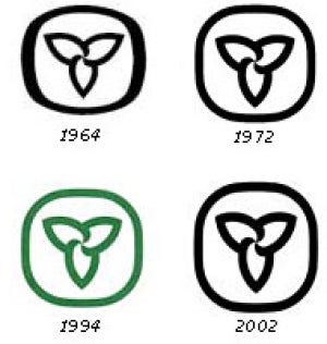

1972. I don’t think the Davis version required any Liberal tinkering. I didn’t know of the 1994, nor 2002 revisions until now. The 2006 logo is dreadful and represents Liberal attempts to erase memory of what preceded them. Even a government as ballsy as “the Harper government” didn’t have the courage to play with the Canada wordmark. This logo should also be untouchable.Which old one?
2006
Harper did change the National Anthem though. No, that was the Liberals too.1972. I don’t think the Davis revision required any Liberal tinkering. I didn’t know of the 1994, nor 2002 revisions until now. The 2006 logo is dreadful and represents Liberal attempts to erase memory of what preceded them. Even a government as ballsy as “the Harper government” didn’t have the courage to play with the Canada wordmark. This logo should also be untouchable.
‘Twas. That I feel less strongly about. Tinkering with iconic visual symbols is a no no. Updating wording - I’ll never remember it - it’s not the version burned into my skull - in the name of gender balance is fine.Harper did change the National Anthem though. No, that was the Liberals too.

View attachment 164106
- I tried to lighten up the blue a bit - to more like the Maple Leafs, or to represent water. The green and gold are official Ontario colours (although I don't really know this from seeing existing flag or teams - such as in Canada games or Brier). The red is from the old flag.
- The crown represents our Monarchy, and also King's highway system (around since the 1930's) which connects Ontarians.
- The 3 Maple Leaves represent the old flag (and has been on coat of arms for over 100 years).
- The Trillium is the symbol of Ontario for the past 50 years (actually, since 1937).
Way too busy.
If Ontario were to get a new flag, and I like the idea of a proper provincial flag I'd like something simple.
If I was forced to come up with something, I'd take the Pearson Pennant, move the two blue bars from vertical to horizontal, representing the Great Lakes/St. Lawrence and Hudson Bay/James Bay, to represent north and south. The triple maple leaf (often used to represent three founding peoples - First Nations, French and British) would come from the provincial crest, rather than the style used in the proposed national flag (which is now the logo of Dominion City Brewery in Ottawa).
The best US state flags are either simple and distinctive, or just very distinctive. Texas, New Mexico, South Carolina, and Colorado do simple and recognizable well (it's hard to beat New Mexico's). Maryland and Arizona are also very distinctive (though both are a bit busy) and they are very popular. California's is at least rooted in historical precedent.