IMG_2385.jpg

I think some lights have been installed on the building on the west side of Hughson... I don't recall it being illuminated before, but maybe the lights were just never turned on. Gore Park looks quite good looking north... can't say the same about the south side.
 
Just pretend the south side doesn't exist for now lol..

and man.. we NEVER liked the cobalt corner building - none of them they proposed.. I remember on SSP we actually tried to photoshop our own versions to look better, and clearly they didn't even like their own versions as they kept changing the final result.. the white just looks like cinderblock from far away sadly.. but.. it's still better than the other proposals they had.. still, between the right house and the newly renovated Olympia club, it just doesn't feel like it measures up. The brown brick part with the black cornice beside the Olympia club is at least a BIT better.. but yeah.. need a more impressive cornice to measure up to the buildings on each side of it.. oh well.. they tried, and we thank them for not putting in a generic glass podium at least, even if I am sure this was very much a learning experience for them on several fronts. Let's hope they learn from it.

Also needs some uplighting like the buildings on either side have too, maybe that would help. Was uplighting never installed on it? Seems odd..
 
Photo from the east mountain. At 30 storeys, it's nice that the buildings don't interfere with the view of the top of the escarpment on the other side of the Dundas Valley (needlessly provocative comment fully intentional) :) But also, really nice addition to the skyline that these buildings bring!

431485893_334180022408722_4365769459861274575_n.jpg
 
Once design District is up and The Rebecca along with 73 Hughson St North, this view will look impressive.
 
I still don't get why the grey stone has blotchy patches all over it... is that dirt? Cement? What is that?
Maybe an attempt to age the blocks? Might just be dirt. The McMaster residence has underside metal panels that are clearly dusty from sitting somewhere dusty and they're likely not going to be cleaned. These smaller details are often missed. Like the Marquee building still missing a panel over the garage entrance.... That bothers me to no end.
 
Maybe an attempt to age the blocks? Might just be dirt. The McMaster residence has underside metal panels that are clearly dusty from sitting somewhere dusty and they're likely not going to be cleaned. These smaller details are often missed. Like the Marquee building still missing a panel over the garage entrance.... That bothers me to no end.
I seriously hope it's just dirt and not an attempt to "age" the blocks - a new building should look new and age naturally..

and yeah little details like that bother me too.. IN CASE IT WASN'T OBVIOUS hahaha... I mean, look at the top of the white one on the corner.. it just looks.. filthy..

*goes in with a powerwasher*
 
Looks accurate to me!

29970-165362.jpg

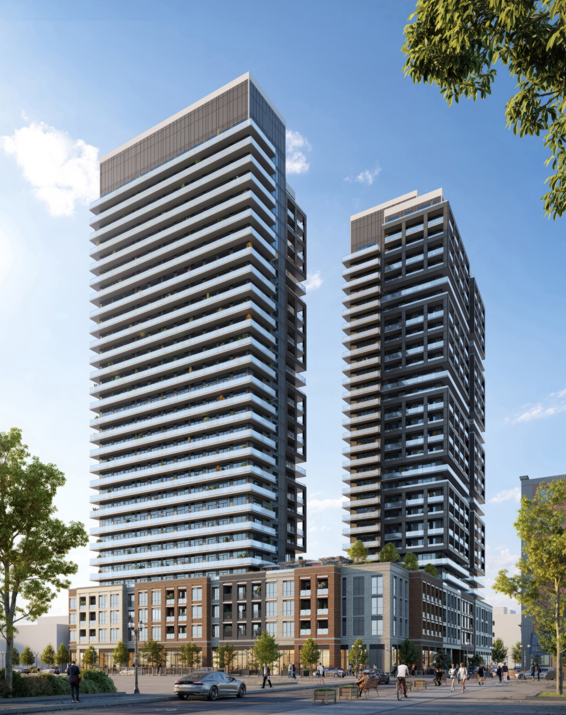
Thaaaat's not the render they had up on their site before, nor was it the one on the signage had up haha - the podium has gone through "several" different iterations.

Leeet's visit some of the others:

ftMwGDh.jpg


m1W6jd0.png


DOR3cenUQAE6ehc.jpg


DOR3cenVQAEiLQF.jpg


CtSSJSU.jpg


a8d4e6cd-a4f5-4f84-ac1e-f5744d0a51a6-jpeg.439286


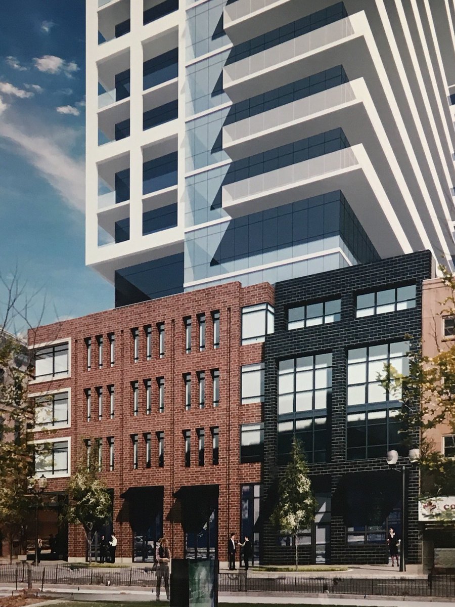
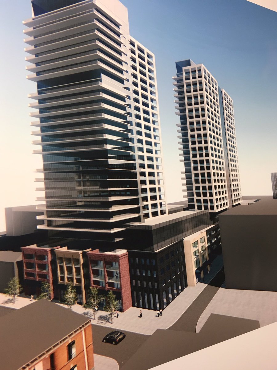
You can see even the podium on the signage did not match what was eventually created so nope - it doesn't window most accurate design to final result - the tower part? Maybe. The podium part? Mmmmnope. lol. That design you posted was posted long after the fact hehe.

This is only some of them too - I am missing a few between when they were still trying to incorporate the old kresgys design, and some of the later designs wen they were trying to make a better king facing front.. hehe..

Kinda wish they had been able to keep it with the art deco look in the first one - but there was only one stamp of that design left and it's somewhere in bc - all the niceties of it were stripped off long ago.. that and yellow brick ages HORRIBLY. I actually was mentioned by the spectator for finding the original mold for the art deco designs.
 
Last edited:
How so?
They might've changed the podium design a few times but the final rendering is pretty damn close to the final product
The towers yes, the podium was a mystery to us how the front would look right up until they added the finishing stone.

I personally hate the front - it doesn't feel cohesive to the extremely historical looking buildings on either side of it - doesn't even look like a "front" really. I find their attempts to "break it up" to look like different buildings very awkward. It's like being boxed in between loving and hating it - because you know it could be much worse, but you also know it could be much better. I feel like they experimented with something they don't normally do, and I applaud their effort, but it could have been better. Clearly they went after it several times from the drawing board.
 
Last edited:

Back
Top