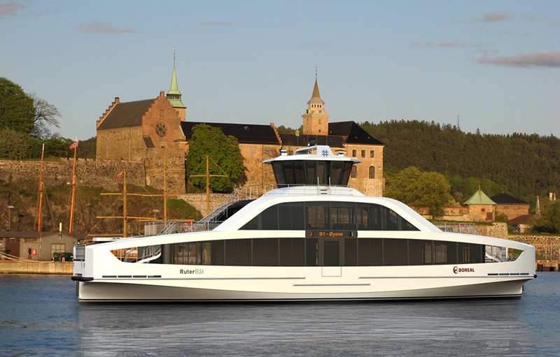
Part of the Oslo ferry system is sea-bus in nature. The emphasis on vessels with mostly indoor amenities and transit like seating is deliberate - many riders are effectively riding a bus. Plenty of their ferries are utilitarian in design - the key feature being traditional double end boarding and a raised bridge with 2-way visibility.
For Toronto, the island ferry is more of the beginning and end of an experience, more likely recreational and definitely not a daily commute. It is not meant to be jet fast, the duration is appropriate as a “pause”. The option of sitting outdoors is more important, and the traditional upstairs with roof protection but open sides is extremely compatible with that experience, on good days anyways. The double end design is absolutely necessary, and some more rakish streamlining would be contradictory to their working speed and design.
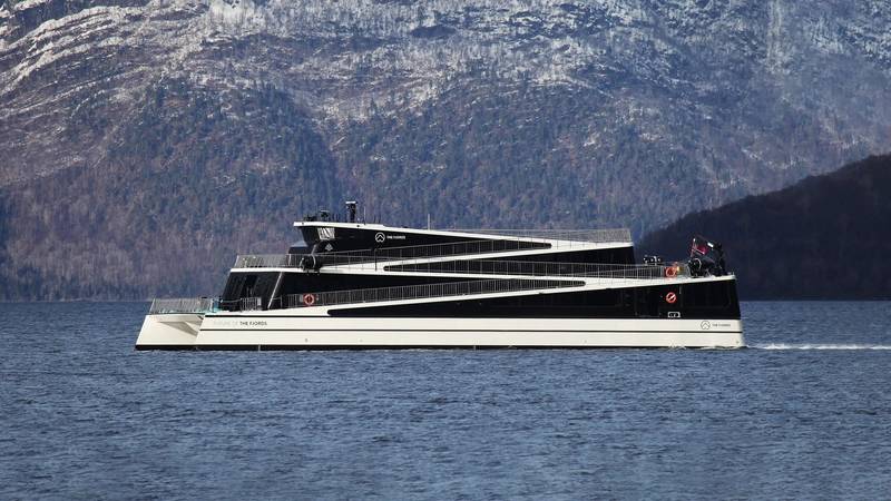
I shudder to think what say Metrolinx design consultants would do to the exterior design. There will be a temptation to use some pseudo iconic motif (the Chichimaun comes to mind, or Norweigian Line cruise ships). To my mind, the current plain white is nicely understated. There is no shame in being traditional in this context.
I am opposed to something flashy. Function and compatibility with existing slips dictates the rounded double end design.
- Paul