Hear ye, hear ye, read all about it! (We have a new front page story with everything here.)
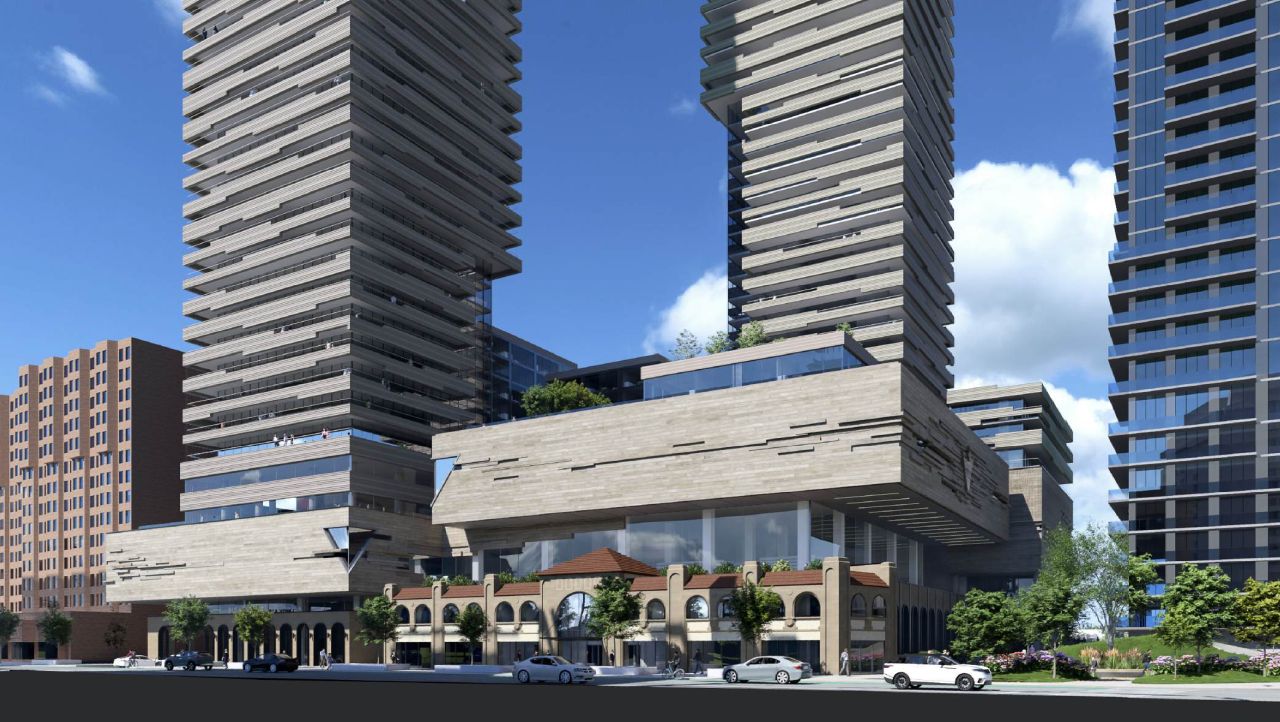
My take on the brutalist look: both the podiums and the towers are now clad as if they were carved out of a sedimentary rock cliff face. Canadian Tire logo shapes appear as windows at a couple corners, while the logo has also been incised into the masonry in places, all suggestive of Canadian Tire's place in Canadian life as being bedrock or foundational in nature. I don't think that's far off the mark. As a fan of brutalism, at least when it's done well, I am hoping for careful attention to details here, would love to see it board-formed concrete, who knows, maybe some of that could be actual stone... but I'm concerned that if the materials are not treated well, this could be a big miss.
42