I am SO glad that the star-bursts are not present in the middle of the square this year. Those were UGLY. I kind of like the tree (pretty much only at night though), but agree that it is kind of small for the square. I would like to see a MUCH larger version in the centre of the square.
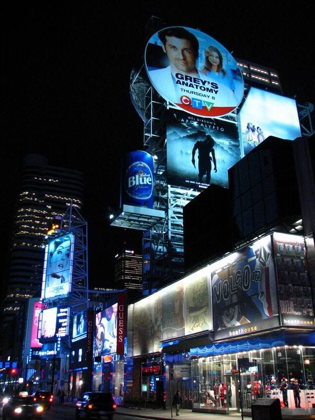
From the pic above, I got an idea for something that would look pretty cool. The tower (1 Dundas I believe) has 2 floors half way up that are reserved for air conditioning units, mainframes, whatever.. Basically there are no offices there. You can see this where there are 2 floors of no lights in the windows. It would look amazing if a 2 story ticker wrapped around the tower at this height. Images could scroll across the screen like inside the SkyDome/ACC etc.
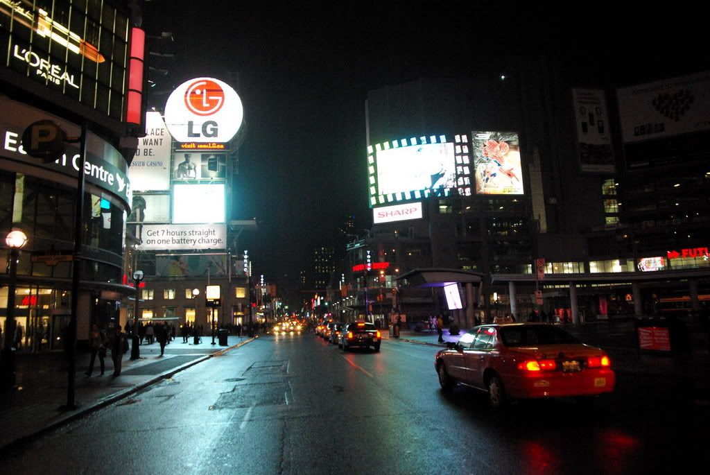
I have said it before, and I will keep saying it. That raised "bus shelter" that lines Dundas Street needs to go. There is no point to having it there. Before it defined the north edge of the square, but TLS does that now.