riker
New Member
Edmonton's current flag fails. Our flag, which has been around since the 60s, is a complex coat of arms and hard to make out at a distance. It also feels very... colonial.
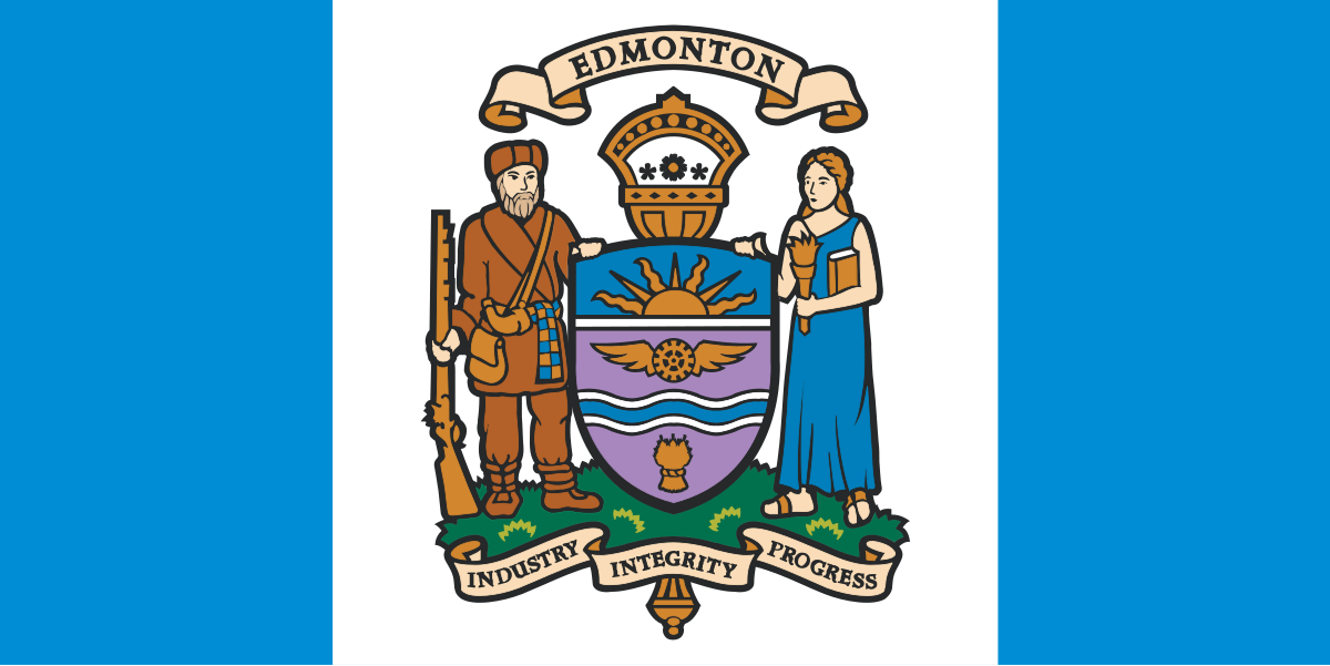
Great flags are a massive source of civic pride. They anchor a city’s "placeness"—that feeling that makes a place actually feel like home. Look at Chicago or Amsterdam. Their flags are everywhere because they’re simple, bold, and iconic. People are happy to drape them over balconies or wear them on shirts because they’re proud to say, "this is where I live."
We had an effort to redesign it back in 2016, but it didn't cross the finish line. That project stalled largely because the design didn't resonate—it felt too abstract and lacked the kind of deep, recognizable symbolism that sticks with people.
I’ve been messing around with a new idea that I think could work better, continuing to use the Canadian Pale layout. Since our current flag uses this structure, keeping it would be a subtle nod to our country. It means the central vertical panel is wider than the two outer panels, creating a perfect, prominent space to highlight our central symbol. It’s a classic, balanced, and visually striking format that elevates the emblem rather than letting it get lost in a busy background.
The concept: The Magpie
I’ve settled on the magpie as the central symbol. They’re everywhere, they’re smart, and they’re tough enough to handle our winters. They are so ingrained in our local identity that Edmonton officially voted the black-billed magpie as our city's official bird in May 2025.
I’m picturing five magpies in an upward arc. This number works on two levels:
I’m looking for a local designer or anyone who knows their way around vector software who might be interested in helping me polish this into a professional file. I am also looking for thoughts and suggestions. As the city welcomes more people, this is an opportunity to imprint a sense of pride and unity for the place we call home.
Great flags are a massive source of civic pride. They anchor a city’s "placeness"—that feeling that makes a place actually feel like home. Look at Chicago or Amsterdam. Their flags are everywhere because they’re simple, bold, and iconic. People are happy to drape them over balconies or wear them on shirts because they’re proud to say, "this is where I live."
We had an effort to redesign it back in 2016, but it didn't cross the finish line. That project stalled largely because the design didn't resonate—it felt too abstract and lacked the kind of deep, recognizable symbolism that sticks with people.
I’ve been messing around with a new idea that I think could work better, continuing to use the Canadian Pale layout. Since our current flag uses this structure, keeping it would be a subtle nod to our country. It means the central vertical panel is wider than the two outer panels, creating a perfect, prominent space to highlight our central symbol. It’s a classic, balanced, and visually striking format that elevates the emblem rather than letting it get lost in a busy background.
The concept: The Magpie
I’ve settled on the magpie as the central symbol. They’re everywhere, they’re smart, and they’re tough enough to handle our winters. They are so ingrained in our local identity that Edmonton officially voted the black-billed magpie as our city's official bird in May 2025.
I’m picturing five magpies in an upward arc. This number works on two levels:
- History: They represent the five towns/settlements that came together to make Edmonton: Beverly, North Edmonton, Jasper Place, Fort Edmonton, and Strathcona.
- Symbolism: The five can also represent the essential elements of this place—the sky, the flora, the animals, the water, and the people—drawing inspiration from the interconnectedness central to Indigenous worldviews.
I’m looking for a local designer or anyone who knows their way around vector software who might be interested in helping me polish this into a professional file. I am also looking for thoughts and suggestions. As the city welcomes more people, this is an opportunity to imprint a sense of pride and unity for the place we call home.
